As a budding photographer I quickly learned that it wasn't about the kind of camera you own or how many lenses you have, in the end, as well as a connection with the subject it's all about the light. Lighting is mysterious to many and often goes unnoticed as we go through our daily activities not really seeing the amazing show of light and shadow around us. Picking up a camera and pointing it at something seems like a very easy process, and it is, but when you look at the back of the camera to see what you've done it can be a big disappointment. Seeing good light takes practise and lots of it, the camera is only a device to capture good light. Good lighting creates shape and mood and feeling. How do you recognize light? Look at it, study it and when you see it with a camera in hand know the mechanics of exposure to capture it. Sounds easy, and it is, when you observe light. One way to learn the craft of lighting when you are starting out is to go to your local art gallery and study the great masters of painting, these people knew light and if you can recreate that your well on your way and like every other craft practice it on a daily basis until you master it. Lighting isn't learned in a couple of weeks, it's learned over a lifetime, you should always keep looking.
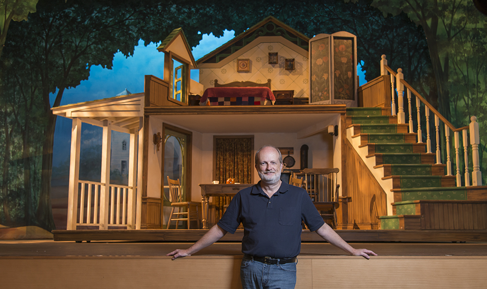
A while back I got a lovely assignment to photograph a man named Kevin Fraser, Kevin is a lighting designer for theatre productions at the Stratford Festival as well as many others through out Canada.
Kevin Fraser Lighting Designer ©2017 peter tym
Kevin knows light, and he has the ability to light large theatre scenes in a way that makes sense to the brain of the viewer and sets the mood for the audience. As each scene in the play changes there might be a whole new lighting design involved, as a photographer you can see why I say that Kevin and other lighting designers know light in a big way so the next time your at a play or a movie appreciate what you see and learn.
Kevin Fraser Lighting Designer ©2017 peter tym
As a photographer when you are given an assignment by a magazine to photograph a subject like Kevin they want you to come back with a variety of photographs both horizontal and vertical, some tight and some loose in case they want to do different variations in layout design or want to lay the copy into the photograph or lay the photograph across the gutter of the magazine. The photographs in this piece would depict a good selection for a page layout.
Kevin Fraser Lighting Designer ©2017 peter tym
Lighting design for a theatre production or a movie is a large scale effort as the light sources are many but put together they have to make sense and look as though they are coming from one source as nature intended, after all there is only one sun in the sky. In other words the same principles hold when you are lighting a large object or lighting one person for a portrait, the light has to make sense to the viewer of the photograph, so one main or key light gelled with a warming filter a subtle fill light or card on the dark side and a back ground light for separation. There are many ways to come to the same place with this lighting ratio but as a rule it should always make natural sense to the brain, the lighting should look the same as it does in nature, don't change that. When you think of nice light it is always in the morning or at dusk with the light coming in at a low angle warm and beautiful. This is how you should set your lights with the warm gelled key light copying the warm orange glow of the morning or evening light. I love doing assignments like this were a story is told about a person who is really good at their craft, who has put years into the process and you can literally see the passion. I always strive to better my lighting and work on it every time I go out to do a portrait, it's were the art is. On this assignment I will give the credit for the lighting to the designer Kevin Fraser.
Kevin Fraser Lighting Designer ©2017 peter tym


